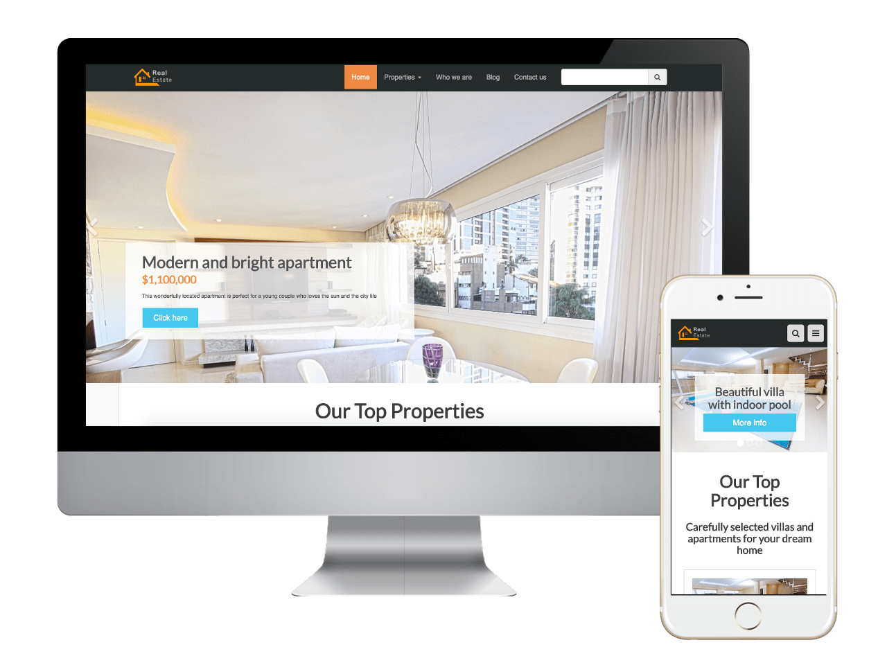
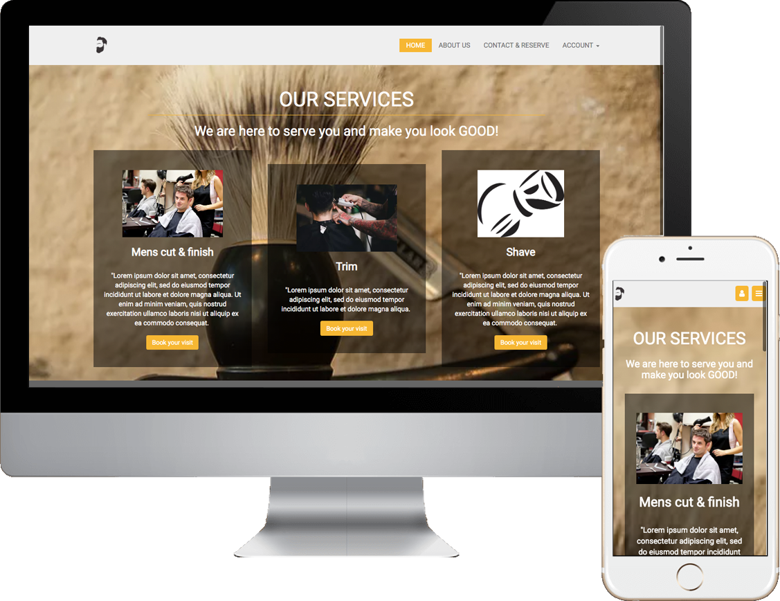
Homepage * clone TrenzySites
  • Home
  • Features
  • Templates
  • Templates Org
  • Showcase
    • Showcase
    • Video Background
  • Marketing
    • Marketing
    • Contractor Templates
    • Home * clone
    • Lead Marketing Pages
    • Forms
      • Forms
      • Real Estate Showcase
    • Hair Salon #1
    • Barber Shop 1
    • Mobile Detailing
    • Auto Repair
    • Contractor Templates 2
    • Contractor Templates Basic
    • Pet Grooming
      • Pet Grooming
      • Pet Grooming DFY Website
  • Single Site
  • Private Area
    • Private Area
    • Business Marking Pages
    • Import a Website
    • Agency Plan Options
    • Business Plan Options
  • Blog
  • Map Widget
  • Mobile-First
  • Prices
  • Login | Create Account
  • Support
  • Mobile-First Guide
  • Plan Bucket
    • Plan Bucket
    • Basic Plan Options
    • DFY Pricing
    • Entrepreneur Plan Options
    • DFY Pricing * clone
  • Blog
  • Contractor Templates
  • Lead Marketing Pages
  • Home
Previous Next

Trenzy-Sites

Create Your Own Website With Fast Loading Mobile-First Technology...

Our Trenzy WebBuilder platform builds sites for speed. It's what Google likes! Start with one of our Beautiful templates and have a full website in about 10 minutes.

Get Started

Two Ways To Success

Use our web-builder or our web design service.

You searched for: "Salon"
Reset
No items to show for this list
Reload  


pROFESSIONALLY DESIGNED TEMPLATES TO GET YOU STARTED FAST

Gain an advantage against your competitors in Google's "Mobile-First" indexing. Our Templates are not just responsive, their MobileFirst and built for fast loading.

You searched for: "Salon"
Reset
[all], barber shop, beauty, massage, nail salon, salon
Salon and Beauty
Beauty
,
Salon
,
Barber Shop
,
Nail Salon
,
Massage

Salon and Beauty

Two options Do it yourself or let us build and manage the site. If you decide to take it over we drop it into your account so that you or your designer can update the site for you.
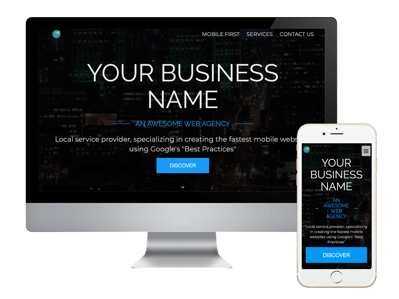
Previous Next

Trenzy WebBuilder

TrenzySite Builder revolutionizes website design by building MobileFirst.

Use this platform to create truly amazing and extremely advanced websites that work perfectly on mobile and desktop.

Change texts, images and pages, add a sidebar, customize domain and navigation bar - everything with a couple of clicks and a few, simple touches.

Add buttons, links, sliders and even more advanced widgets to create astonishing web apps for you and your customers.

This is a button

SUBSCRIBE

FREE INTERNET MARKETING MAGAZINE

About every month you'll receive our internet marketing magazine. With the latest news, tips and tricks on marketing on the internet.

Build A Website In Minutes

Domain Name - Customizable Templates - Email Address - Build MobileFirst for Speed - Widgets - Hosting - Video Tutorial Section - Phone Support


About Mobile-First

Have the best-performing, fastest loading mobile and desktop sites on the Internet (load times 3 sec. and less)*

Studies show 53% of website visitors leave websites if the page doesn't open in less then 3 seconds.

Google has indicated site speed (and as a result, page speed) is one of the signals used by its algorithm to rank pages.

As of March 2019 GOOGLE AND OTHER SEARCH ENGINES HAVE SHIFTED TO MOBILE-FIRST.

What that means is if your website is not built for Mobile First, it will mean the difference between showing up in the search results (Whether paid or organic) or disappearing completely.

Mobile-First Indexing Is Now A Reality. In fact, if we look at Google's actions, it's undeniable that 2019 will be the year of page speed. It's the year when the difference between fast and slow content becomes the difference between showing up in the search result or getting pushed back or disappearing completely.

The mobile-first approach is exactly as it sounds: designing with mobile displays as a priority and working up. In the past and even today, virtually every system creates a website for the desktop first Then it adjustments, resizes, or reduces' that page down to fit for proper fit on tables, iPads and phones. This creates havoc on page loading speeds. This resizing slows down the delivery to your visitors, and depending on how slow the site is presented, you are most likely loosing customers customer.

Our sites are built with an adaptive design. This basically means that our system has created a website and webpage layout designed for each type of mobile device, tablet and desktop system.

When a search is done, our system recognizes the device as a mobile phone, a tablet or desktop, and presents the perfect website or webpage for that specific device.

As of March 2019 GOOGLE AND OTHER SEARCH ENGINES HAVE SHIFTED TO MOBILE-FIRST.

What that means is if your website is not built for Mobile First, it will mean the difference between showing up in the search results (Whether paid or organic) or disappearing completely. Read More...


Have the best-performing, fastest loading mobile and desktop sites on the Internet (load times 3 sec. and less)*

Studies show 53% of website visitors leave websites if the page doesn't open in less then 3 seconds.

Google has indicated site speed (and as a result, page speed) is one of the signals used by its algorithm to rank pages.

As of March 2019 GOOGLE AND OTHER SEARCH ENGINES HAVE SHIFTED TO MOBILE-FIRST.

What that means is if your website is not built for Mobile First, it will mean the difference between showing up in the search results (Whether paid or organic) or disappearing completely. Mobile-First Indexing Is Now A Reality.

In fact, if we look at Google's actions, it's undeniable that 2019 will be the year of page speed. It's the year when the difference between fast and slow content becomes the difference between showing up in the search result or getting pushed back or disappearing completely.

The mobile-first approach is exactly as it sounds: designing with mobile displays as a priority and working up. In the past and even today, virtually every system creates a website for the desktop first Then it adjustments, resizes, or reduces' that page down to fit for proper fit on tables, iPads and phones. This creates havoc on page loading speeds. This resizing slows down the delivery to your visitors, and depending on how slow the site is presented, you are most likely loosing customers customer.

Our sites are built with an adaptive design. This basically means that our system has created a website and webpage layout designed for each type of mobile device, tablet and desktop system.

When a search is done, our system recognizes the device as a mobile phone, a tablet or desktop, and presents the perfect website or webpage for that specific device.

MarketingTrenz

90 E. Pembroke Rd, Danbury, CT 06811
Phone: (203) 941-3177
Email: info@marketingtrenz.com

TrenzySites Web-Builder

  • Home
  •  
  • Features
  •  
  • Templates
  • Mobile-First
  •  
  • Prices
  •  
  • DFY Pricing
  •  
  • Lead Marketing Pages
  • Support
ToS | Privacy

Heading