


Do It Yourself WebBuilder
With our TrenzySite Builder and Preloaded Templates that we include in your account you'll be able to start with a pre-built website. Simply pick out a design that you like, add your contact info and text and have your website done in around 10 minutes!
Professional Development
Don't care to build it yourself? No problem, let our team of professionals design and maintain your site. No commitment, at any time if you want to take over, we'll release the site into your own account with the tools you need to make future updates.

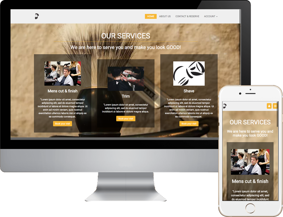
Salon and Beauty
Two options Do it yourself or let us build and manage the site. If you decide to take it over we drop it into your account so that you or your designer can update the site for you.

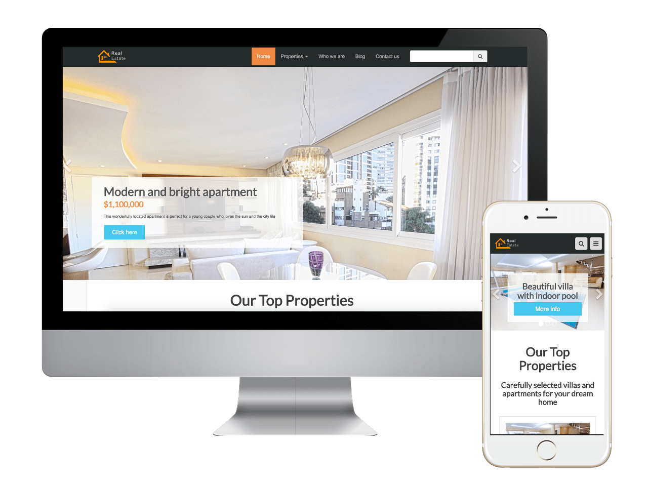
Real Estate
Create a landing page for motivated sellers. We'll have the site up and running immediately. You focus on selling houses.
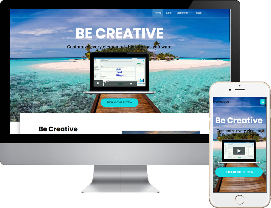
Be Creative
Get creative with with this quality website template. This plan includes this Be Creative template along with many other templates that you can choose from to build the ultimate fast loading website that will index will with Googles latest requirments for better results in their search engine.
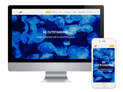
Outstanding
This is an Outstanding webpage template. As a matter of fact this was used as a base template to credit this website!
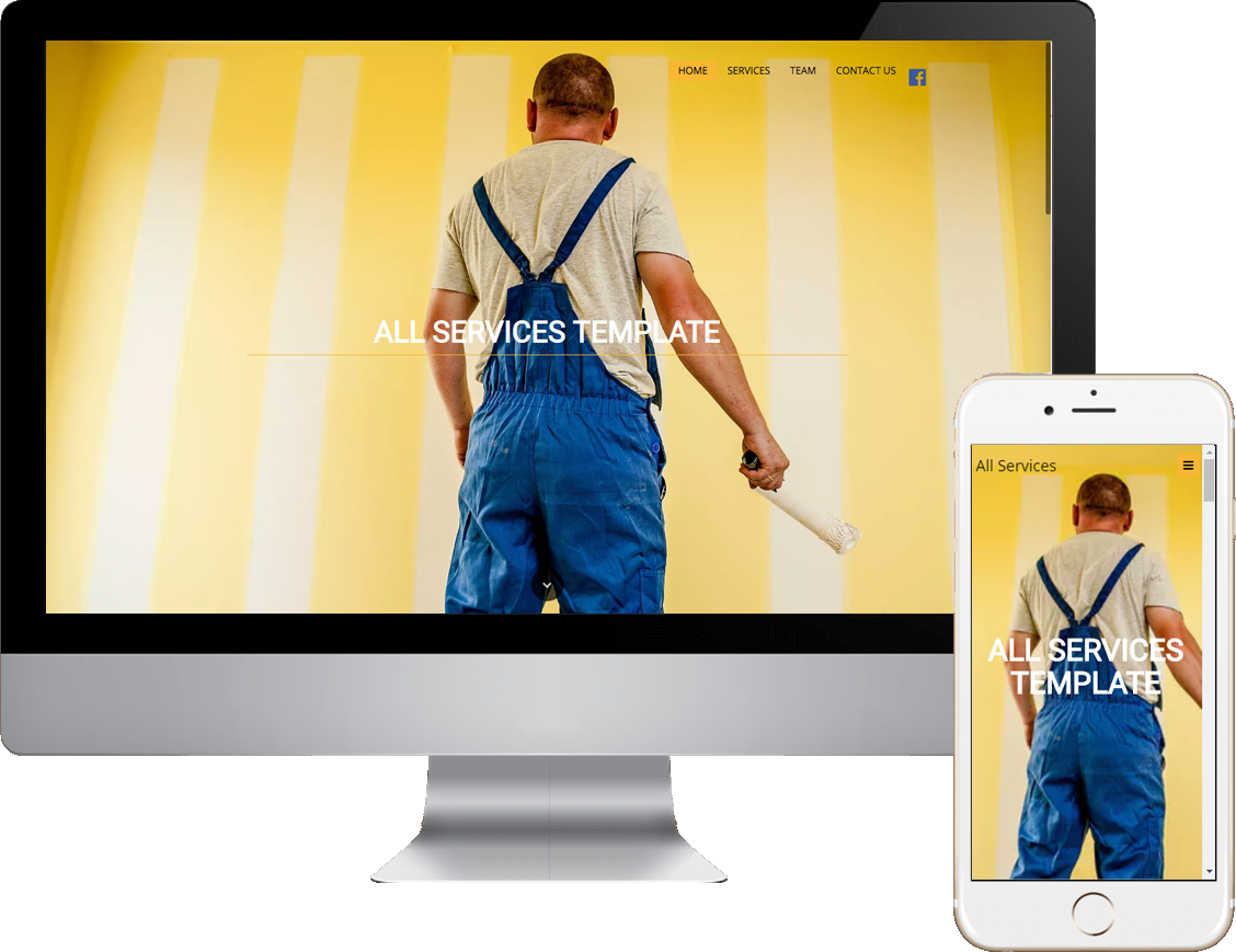
Contractor
This website template is perfect for contractors, painters, plumbers and any one in the renovation and construction business.
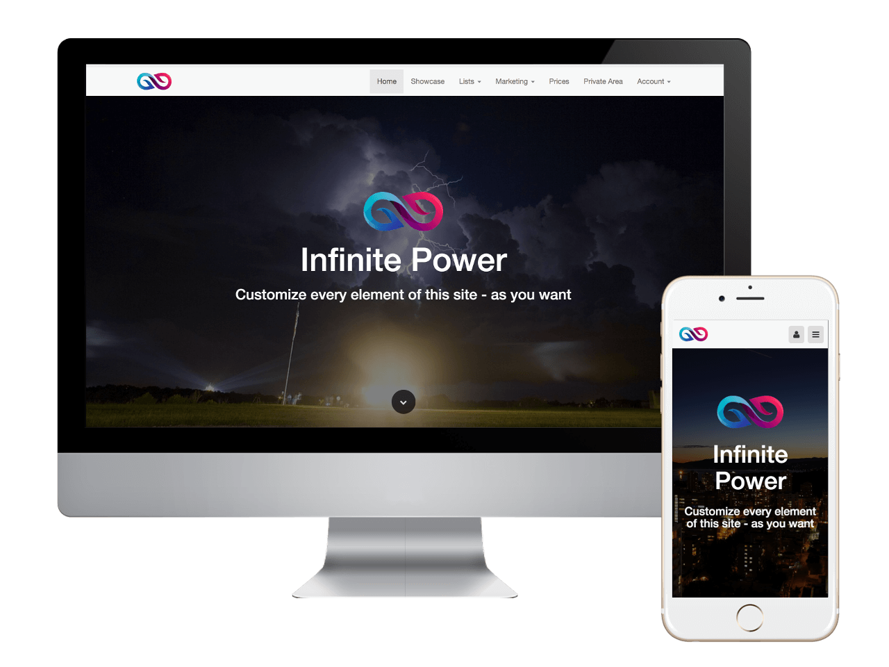
Infinite Power Template
Another premium website template

Trenzy WebBuilder
TrenzySite Builder revolutionizes website design by building MobileFirst.
Use this platform to create truly amazing and extremely advanced websites that work perfectly on mobile and desktop.
Change texts, images and pages, add a sidebar, customize domain and navigation bar - everything with a couple of clicks and a few, simple touches.
Add buttons, links, sliders and even more advanced widgets to create astonishing web apps for you and your customers.

The mobile-first approach is exactly as it sounds: designing with mobile displays as a priority and working up. In the past and even today, virtually every system creates a website for the desktop first Then it adjustments, resizes, or reduces' that page down to fit for proper fit on tables, iPads and phones. This creates havoc on page loading speeds. This resizing slows down the delivery to your visitors, and depending on how slow the site is presented, you are most likely loosing customers customer.
Our sites are built with an adaptive design. This basically means that our system has created a website and webpage layout designed for each type of mobile device, tablet and desktop system.
When a search is done, our system recognizes the device as a mobile phone, a tablet or desktop, and presents the perfect website or webpage for that specific device.